Working with Statista
How to configure the visualization of statistics
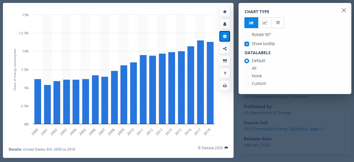
Using the gear button you can configure the visualization of every statistic. You can choose, for example, between a bar or line chart or a data table.
You can also configure the data labels here. In case a chart looks overcrowded with data labels, you can, for instance, remove individual labels by clicking on them, before downloading the statistic by selecting Custom.

Settings for a statistic
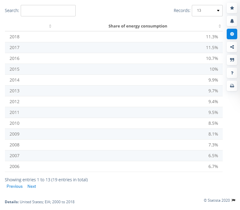
Example table:

Example of a statistic in table format
Example line chart:

Example of a statistic in line chart format
You can also configure the data labels here. In case a chart looks overcrowded with data labels, you can, for instance, remove individual labels by clicking on them, before downloading the statistic by selecting Custom.

Example table:

Example line chart:

- - Welcome to Statista
- - Statista account setup
- - Your access to Statista
- - Working with Statista
- - Content types overview
- - Insights
- - Personalization
- - Publishing Statista content
- - Statista for corporate customers
- - Statista for universities
- - More Statista Services
Learn more
Please also consider our other resources to help you and your team to make the most of our data.
- Learn more about our Business Solutions
- Explore success stories from clients using our products and services
- Include data with the Statista API
- Kick off research projects with our Research & Analysis-Team
- Help & FAQ
- Ask us something