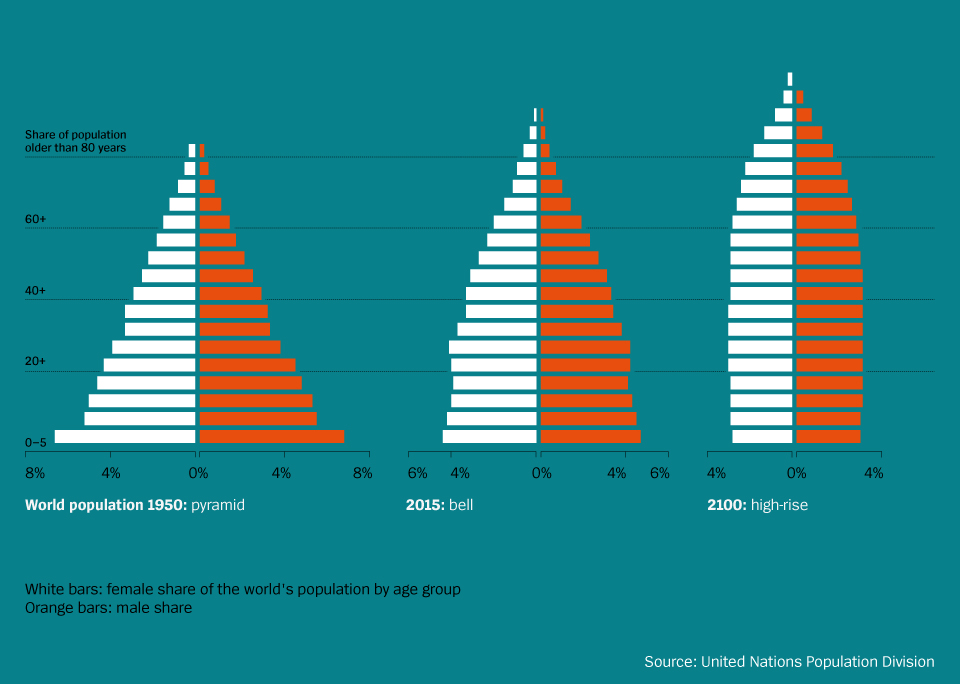
From pyramid to bell to high-rise building — that is how the age structure of the world’s population will have developed from 1950 to 2100, according to UN calculations, which is a good thing. It means that we can say farewell to the pyramid. which to many still symbolizes the ideal age structure of a population: lots of industrious young folks and few dependent old people.
First and foremost, however, the pyramid means that in every age group many millions of people die. To illustrate this, imagine you could climb the stairs of the perfectly shaped German population pyramid of 1910. With each further step, or rather year, tens of thousands of people would vanish from the statistic. Infants, toddlers, adolescents, twenty-, thirty-, forty-year-olds, most of them died of illnesses like of scarlet fever, diphtheria, diarrhea, typhoid, tuberculosis or in childbed.
A closer look at the present state of affairs in certain nations reveals that it is countries from the lower end of the UN Human Development Index in particular whose populations’ age structures still resemble pyramids. Pyramids mean poverty, which means diseases, which means early death. From a global perspective, we – thanks to the demographic shift, which goes along with less children and longer lifespans worldwide – live inside a bell today.
If everything goes well, the structure will change its shape once again by the end of the century, as calculations by the German World Bank economist Wolfgang Fengler suggest. Mankind will then be living in a high-rise building whose stories, or rather age groups, will all be inhabited by about the same amount of people each. It is only towards the building’s top quarter, which is where the 70- to 100-year-olds live, that the structure narrows abruptly. For it is the old, not the young, who die in this house.
This post is brought to you in collaboration with German news magazine DER SPIEGEL. The chart and text were first published by German journalist and author Guido Mingels. It is available as a book here.
As always, our charts are free to use and share, just quote DER SPIEGEL/Statista as the source and include a backlink to the graphic's URL (this page).
From Pyramids to Skyscrapers
World Population

Description
This chart shows the age structure of the world's population in 1950, 2015 and 2100


